Isoluminant Color Picking for Non-Photorealistic Rendering
Graphics Interface, June 2005
Abstract
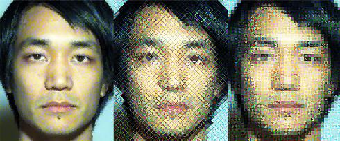
The physiology of human visual perception helps explain different uses for color and luminance in visual arts. When visual fields are isoluminant, they look the same to our luminance processing pathway, while potentially looking quite different to the color processing path. This creates a perceptual tension exploited by skilled artists. In this paper, we show how reproducing a target color using a set of isoluminant yet distinct colors can both improve existing NPR image filters and help create new ones. A straight-forward, geometric technique for isoluminant color picking is presented, and then applied in an improved pointillist filter, a new Chuck Close inspired filter, and a novel type of image mosaic filter.
Paper
Links
- Project page with supplementary material
Citation
Tran-Quan Luong, Ankush Seth, Allison Klein, and Jason Lawrence.
"Isoluminant Color Picking for Non-Photorealistic Rendering."
Graphics Interface, June 2005.
BibTeX
@inproceedings{Luong:2005:ICP,
   author = "Tran-Quan Luong and Ankush Seth and Allison Klein and Jason Lawrence",
   title = "Isoluminant Color Picking for Non-Photorealistic Rendering",
   booktitle = "Graphics Interface",
   year = "2005",
   month = jun
}
